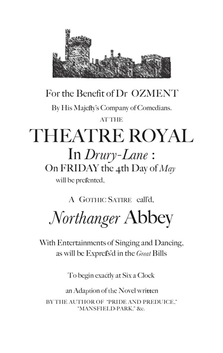
This advertisement was created by Stephanie Kothman, a graduate of Texas A&M University
Critical Introduction
For this project, I chose to create an eighteenth-century playbill for a play adaption of the novel Northanger Abbey by Jane Austen. I used both Photoshop CC and Illustrator CC to create the playbill. The Northanger Abbey playbill is intended for an Eighteenth-Century play-going audience. I was explicit about this play being an adaption of the novel in the playbill. So, it is possible fans of Northanger Abbey could also be part of the intend audience.
Research for this project was divided up into two parts: typographic research and design research. A playbill in the Eighteenth-Century would have been printed on a printing press. The type used during this time was quite specific. The University of Florida offers, as part of their Rare Book Collection, a detailed description of typefaces which would have been used in the Eighteenth-Century. There were many typefaces I could choose from, but I ended up only using Calson and Baskerville. Calson was the main font I used throughout the piece. Baskerville was used for italics and some ligatures which were not available in my Calson typeface. According to my research through the University of Florida’s collection, both of these typefaces could have been used to print a variety of things during the Eighteenth-Century.
The second portion of my research had to do with design. For this research, I started with a quick search on Pinterest. There I found multiple playbills from the Eighteenth-Century. This preliminary research helped me narrow my design choices, but none of the playbills found on Pinterest were used directly for inspiration. Next, I narrowed my search and found the Victoria and Albert Museum’s collection of early theatre posters. The playbill I took the most inspiration from was the Theatre Royal playbill for Rule a Wife, and Have a Wife. I chose this playbill specifically because it provided a clear outline for all the information I would need to add to my playbill. At the top of the Rule a Wife, and Have a Wife playbill is an image which appears hand carved and then pressed on the page. I do not have this ability. So, I found an image of the Abbey which was used in the 2007 film adaption of Northanger Abbey which was published to http://www.jimandellen.org to accompany an article written by Ellen Moody about the film adaption. Then I edited the image using Photoshop CC and Illustrator CC to make it look more like a carved and pressed image.
To design the playbill, I referenced the Rule a Wife, and Have a Wife playbill and only changed the words when I felt it was appropriate. I wanted to acknowledge the novel within the playbill. To do this I found an image of the title page for Northanger Abbey on the Jane Austen Society of North America’s website. The title page does not include Austen’s name, but states: “By the author of ‘Pride and Prejudice,’ and ‘Mansfield-Park,’ &c.” So I chose to write at the bottom of the playbill: “an Adaption of the Novel written by the author of ‘Pride and Prejudice,’ and ‘Mansfield-Park,’ &c.” This is the only portion of the design which may not be historically accurate. I was unable to find a playbill of a play which had been adapted by a novel. So, this is the only creative liberty I took with the text.
When designing the playbill, I was careful to include the proper ligatures. I only used the ligatures available in the typefaces for Calson and Baskerville. Unfortunately, there may be some missing ligatures, but I used ligatures where needed, if they were available. I made a conscious choice to mix and match the typefaces. In all the playbills I looked at from the Eighteenth-Century, there were inconsistencies in the type. These inconsistencies are not surprising. Each individual letter would have had to be placed by hand. It is possible some of the type would be inconsistent. The leading and kerning of the type would also be varied if it were printed on a press. Leading is the space between lines of type. Kerning is the space between characters and words. To replicate this, I manually increased and decreased the kerning on some, but not all of the words. To replicate the inconsistencies with the leading, I made each line of text a separate object and manually placed each line separately. Looking at different types of playbills helped me achieve the printing press look to the design.
Works Cited
- Austen, Jane. Northanger Abbey; Lady Susan; The Watsons; Sanditon. Oxford University Press, 2008.
- “The Gothic Northanger Abbey: A Re-Evaluation.”, http://www.jimandellen.org/austen/gothicna.html.
- “GRAPHIC DESIGN: TYPOGRAPHY.” ART 3283C, web.uflib.ufl.edu/spec/rarebook/art3283c/18th.htm.
- Museum, Albert, and Digital Media. “Victoria and Albert Museum.” Theatre Posters, Victoria and Albert Museum, Cromwell Road, South Kensington, London SW7 2RL. Telephone 44 (0)20 7942 2000. Email Vanda@Vam.ac.uk, 1 Dec. 2015, http://www.vam.ac.uk/content/articles/t/theatre-posters/.
- “Northanger Abbey.” Jane Austen Society of North America, http://www.jasna.org/austen/works/northanger-abbey/.
- “Playbills from Eighteenth-Century Britain.” Pinterest, http://www.pinterest.com/lewiswalpolelib/playbills-from-eighteenth-century-britain/?lp=true.
Copyright 2018 Stephanie Kothman


